
View The Work (Alternate Version).
Concept is dead.
 Well, not really. It has been redefined. As a computer program advertisement boldly proclaims, "Style is Concept" (Labuz 168). The coolness and experimentation are indicative of a design philosophy in which image is used as a visual lure to seduce the viewer. This non-conceptual design is seen in many different facets of the post-modern design vocabulary.
Concept as intriguing idea is still as strong as ever. A glance through any design annual is proof enough that proponents of concept in its most traditional form are still alive and well. This paper however is not about concept-driven design. Rather, in this paper the myriad approaches to nonconceptual design will be explored along with an assessment of such approaches.
The connotation of nonconceptual design is itself vague. For the purposes of this paper, nonconceptual design refers to design in which no discernable message or endorsement is present beyond the content of text within the design. This definition still leaves many different facets of nonconceptual design to discuss.
To begin with, a brief analysis of visual communication essence is helpful. The fact that design is a visual language is basic. Pictures can stand for ideas, or merely for feelings (Lupton, 41). Regardless, image communicates more readily than text. Words are a learned and agreed upon abstract level of communication that signify ideas. They do not instantly communicate and they do not communicate over language barriers. This slows the exchange of information. In contrast, image as message carrier can communicate an idea--even a fairly complex one involving metaphor or hyperbole--instantly and concisely. The abstraction of images is one step closer to the actual idea than the abstraction of words.
Besides verbal message, image can also communicate feeling. Every student in basic design is exposed to the emotive force of image. Image can be used to express feelings ranging from trepidation to tranquility. At best, this emotive force is relied upon by proponents of "non-conceptual" design in order to sell an idea or to associate a feeling with a particular product. Many designs of today are retreating from the hard sell of the past (Lupton 196) in favor of offering not a product so much as an image. This echoes the design philosophy of turn of the century Western European graphics.
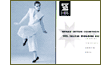
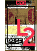 The feelings associated with and initiated by image are capitalized upon in order to access specific markets. For example, in the advertisement for Levis shown here, the product is not even present in the composition. Rather, the opportunity is used to position Levi's as a youthful, contemporary, not too uptight company that is on the cutting edge. Here, the design works. Basically, blue jeans are blue jeans. In this design, image is concept. Besides purely superficial elements of construction, brand and image are the only way to differentiate a product from the myriad of competitors. There are no earth-shaking concepts present here. Merely the suggestion that your lifestyle can be brought more closely in line with this image if this product is purchased.
In this case, the non-conceptual imagery serves to position the product. Sometimes however, non-conceptual design is seen as an end into itself. When the aesthetic is the primary motivation in creating design, it can best be viewed as fine art.There are those designers who champion this end of design (Carter, 106), and given the right subject matter and the correct environment, design as fine art can work. However, when generated by accident as the result of shallow thinking or an untrained eye, nonconceptual design can be relegated to the level of "eye candy."
 The work of Debra Weier can be seen as an example of design as fine art. She runs her own press dedicated to the design and publishing of fine limited-edition books (105). The impetus for her design arises as a counter for the massive onslaught of digital communication in today's world and the need to preserve the traditional forms of what she refers to as "book art" (105). Her designs are very much about the tactile experience of book design as a sculptural experience (105). Beyond that, however, the designs do not communicate a concept in the traditional sense. The illustrations are non-objective explorations of space and texture. Like others before her such as Lissitzky or Bayer, Weier does not observe a distinction between fine and applied art (Carter 107). She considers any such barriers artificial and unnecessary (107).
The tactile qualities of the masterpieces Weier produces are undeniable. However, in a communicative sense, a definite message is not present. The viewer is free to interpret as whim dictates. Besides that, any communication supplementary to the actual text of the book is not present. And besides the visceral impact of the book itself, no specific feeling is communicated with the illustration. The body of the book is the only information medium. In terms of blurring the line between graphic design and fine art, Weier seems to lean firmly to the side of fine art. While technically design, the work is not as much about the message as about the overall impact of the work. For most people, the design would carry similar impact even if they could not read the text.This attention to image for image sake relegates work such as Weier's much more to the "fine art" side of the fine/applied art dichotomy.
This trend is seen very much today in self-promotional pieces sent out into the marketplace. With the advent of computer technology, an almost nostalgic fascination with visceral design is common. This allows image to serve as concept.
 The computer has caused a huge impact on design's nonconceptual component. As Philip Meggs asserts, "creativity and invention have often involved working around constraints" (4). There are those such as Rudy VanderLans and April Greiman who have embraced the computer and its limitations from the beginning to create a striking new visual language. From the beginning of computer graphics in the late 1970s, the newness of the medium and its lack of sophistication was endorsed by designers who referred to themselves as the new primitives. Their goal was to capitalize on the "computerized look" and to use that as a main component in their design concept.
Nonconceptual design as it applies to the new primitive design must be qualified at this point. By nonconceptual, it is implied that no single concept is readily apparent in the work as a means to propagate an idea or set of ideas. This does not mean that a strategy is not at work. The new primitives have a clear outline of goals for their design. Instant concept recognition is not among them. The visual language they achieve through experimentation is itself a concept.
Proponents of such nonconceptual design "eschew the modernist technique of directed communication" (Labuz 50) and instead endeavor to involve the viewer in the creation of the signified information. As Greiman puts it, "[i]t seemed to me that the human brain could sift through all that information and maybe enjoy it" (52). The reasoning behind not having a concept is specifically so the reader can not grasp the message in a single moment. The viewer is attracted by the image, but forced to interact with the design in order to garner to full value of the message at hand.
 Besides Greiman, another new primitivist named Rudy VanderLans is a proponent of intense reader interaction with the media. Nothing is easy; the viewer has to work in order to see a message.Type is "gathered together, overlapped, and intertwined" (24). In contrast to a strongly concept-driven form, VanderLans subscribes to the use of abstract imagery with the notion that abstract images can (and should) be given meaning by the viewer (24). This adds to the level of reader interaction with the design and ultimately is meant to create a more personal relationship with the viewer.
This technique is not completely successful. It is certainly only suited for specific venues. The magazine "Emigre" for instance is aimed at a market of graphic designers. Layouts that designers will plod through work only because of the intrinsic curiosity that some designers hold for this experimentation. As design for the general public, the message hidden inside of endless layering and ambiguity may be lost on an audience that has neither the time nor the patience to work for information when so much clearly designed competition is at hand.
Nonconceptual experimentation can often serve as impetus for new ideas and discoveries in the field that benefit the design community as a whole. VanderLans has expressed a desire for his experimentation to be appropriated by others. He considers this a success (24). Indeed, ideas of layering and abstraction have been borrowed by television graphics of MTV or VH1 to indicate a cutting edge look or style. When such ideas are borrowed as in these cases, the added element of motion (which the originals only imply) can serve to reinforce the layering and viewer participation in the process.
 An area in which nonconceptual design flourishes is the underground music culture. Image is concept in many band identities. The use of psychedelic colors and bold, screaming graphics is typical of many bands' approach to marketability on the streets in competition with the next band. Subtlety and subversive undertones are frequently key to many concept based graphics, but a wide cross-section eschews any deeper intellectual meaning in favor of capturing the soul of the dance floor. "Style [is] an integral part . . . of the . . . dancefloor scene." This envelopes the aspects of attitude and decoration (Rose 42).
This adherence to style and to coolness, which is still championed by many underground bands, has filtered into the mainstream. This is typical of many initially underground movements. For the environment, the nonconceptual approach seems to work. Here, the approach to design is somewhat successfully married to the problem at hand.
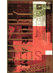
It succeeds in communicating the vitality and soul of the dance floor scene. The example shown here, for the album "bus stop!" is typical of a dance floor esthetic--flagrantly cool, using wild and vibrant colors that ultimately accost a viewers senses and entice a feeling of speed. The success of this nonconceptual style with the masses is an additional endorsement of "style as concept" that is fundamentally for the people.
 In all of the examples discussed, design as a nonconceptual approach has been a conscious choice. It can work if used to a greater purpose. However, a worst-case scenario for non-conceptual design springs forth from the world of desktop publishing. As more people with personal computers begin to fancy themselves designers, the amount of unthoughtful "concept-free" non-designed work seems to propagate itself at a frightening pace. As the public increasingly devalues good design, it attempts to make do on its own. This not only lowers the content and information accessibility quotient of design, but also the aesthetic level of craft and detail.
Propagating this trend are desktop publishing manuals that promote such fix-all solutions as to "stretch type in a computer program 200% for a modern look" (Collier 111), or us[e] "arty, attention-getting advert[isment]" (59). Design created following such connect-the-dots or paint-by-number cliches are continually seen. Non-conceptual design in this case is unintentionally naive and pervasive. Practically all elements of good design are lost in traditional desktop publishing. Here, Style is not concept. Concept is quietly replaced by dogma instead, and style is unfortunately relegated to the depths of the computer's whim.
The approaches to non-conceptual design discussed in this paper each view the notion of "style as content" from a slightly different angle. Each enjoys a varying degree of success in their work. Some employ non-conceptual design at differing degrees of sophistication.The goals of such design are as varied as the practicioneers.
It remains that nonconceptual design as a component of post-modern culture is pervasive. However, the impetus for nonconceptual design is not a unique result of the nonlinguistic essence of visual communication. All visual communication stems from this nonlinguistic essence.
Nothing achieved by nonconceptual design can suffer from the addition of a strong idea-based concept. On the contrary, concepts that involve metaphor or hyperbole can add new dimensions of interaction and humor that not only help design communicate, but also add to the visceral impact of design--increasing the perception of value that accompanies it.
Concept is not dead.
Nonconceptual design is not evil and conceptual design is not perfect. Both fields of design philosophy exist and will continue to exist. As Ronald Labuz concedes in his book The Computer in Graphic Design,". . .differing [fields of design] perform [their] own service, communicating in a specific and exquisitely unique manner" (200). That is absolutely correct. Neither philosophy nullifies the other.
They are at once vital components of a visual language which must exist to supplement one another.